Insights
Advertising · 10 min read
Brand Identity Refresh Mahindra Case Study: How Mahindra’s Logo & SUV Redesign Drove Growth
By Power admin · August 8, 2026
A few years ago, Mahindra did something that made headlines across the auto industry. They launched a completely new logo just for their SUVs—the sharp, geometric Twin Peaks logo. It wasn’t a random design exercise. This was the company drawing a line in the sand: “Our SUVs aren’t just tough workhorses anymore. They’re aspirational rides for people who want tech, style, and global quality in an Indian package.”
The move was quite discussed as it did feel 'correct'. For years, Mahindra built tough, dependable utility vehicles like the Scorpio and the Bolero, but with the arrival of the XUV700 with plush interiors, ADAS capabilities and aggressive pricing, a visual identity to match its ambition was required. The old logo, fluid and rugged, didn’t quite say “lifestyle SUV” to city buyers stuck in Hyderabad traffic.
This is what a brand identity refresh looks like when it’s done with purpose. Your logo, colours, and overall visual style aren’t static artwork. They’re the face of your business. When that face starts looking tired or mismatched with where you’re headed, it’s time to recreate it thoughtfully.
At HashAdv, we’ve worked with enough Hyderabad brands to know this isn’t about chasing Instagram trends. It’s about presenting who you currently are – accurately – and what you want to aspire to be with respect to who you currently are. Refreshing your identity is really all about … most business owners I have spoken with when they hear that, they are thinking that this is going to be a complete makeover. Often it’s not the case and is certainly not what the owner requires.
Refresh is like cutting off your own hair and buying yourself new clothing and putting those clothes on.
You retain the person, you retain the personality; you retain the history. You recondition or resharpen those presentation components so they perform optimally today and into the future, so it might be simplifying an overwhelming logo design into clearer lines, ditching the heavy gradients and instead opting for the modern look of a solid, striking flat color across all your mobile devices, as well as using some fresh-thinking fonts that’s relevant without being over the top either.
A full rebrand is different. That’s when you change your name, rewrite your story, or chase a completely new crowd. Think Hutch becoming Vodafone, then Vi. Those are massive pivots. Most growing businesses don’t need that drama. They just need their current story to look and sound as strong as it actually is.
Mahindra nailed the refresh. They didn’t touch their tractor or commercial vehicle logos. SUVs got their own mark that echoed the brand’s adventurous roots but screamed modernity. It rolled out across grilles, showrooms, ads, and social feeds without confusing anyone. Customers saw progress, not betrayal.
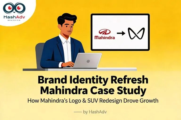
Illustration for brand identity refresh Mahindra case study showing Mahindra logo changing to Twin Peaks logo on a screen, with HashAdv branding and a marketer at a laptop. HashAdv Marcom
Why Your Brand's Look Starts to Feel Wrong Over Time
Run a business long enough, and you’ll notice it. Your logo that looked perfect on the first hoarding now feels fussy next to competitors’ clean profiles. Colors that popped in print look muddy on Instagram. That bold red from 2015 washes out on dark mode websites.
Design tastes shift because life does. People scroll tiny screens all day. They judge brands in split seconds. What worked when hoardings and newspapers ruled attention doesn’t always translate to Reels and Google searches.
Your business changes too. You started serving local shops. Now you’re supplying corporations. Or you went from budget services to premium experiences. The old identity might still say “value player” when you’re charging twice as much for good reason.
Audience expectations evolve. The IT crowd in Gachibowli expects visuals that match their Apple Watch interfaces. Families in Banjara Hills want warmth and trust, not dated clipart vibes. If your look doesn’t speak their language, they quietly move on.
Then there’s consistency—or the lack of it. Over the years, designers come and go. One makes your website elegant. Another blasts hoardings in neon. Your visiting cards clash with your truck branding. Customers get mixed signals, even if your product never changes.
A refresh fixes all that. It doesn’t rewrite your success. It polishes it for the next chapter.
The Mahindra Case Study 1: Recreation Done Right
Let’s dig into Mahindra because they show how this works in practice. The company had massive brand equity. Everyone knew their vehicles as tough, Indian-made survivors. SUVs just went to a higher gear though, practically-wise. Ventilated front seats, connected car technology and large panoramic sunroof came in with the Mahindra XUV700, which pushed its price into the premium segment.
The old “M” logo felt too generic for this evolution. It worked for tractors hauling loads through villages. It didn’t capture city drivers dreaming of highway adventures.
Enter Twin Peaks. Two clean peaks suggesting mountains, motion, endless roads ahead. Geometric enough for laser-etched badges. Bold enough for 20-foot showroom signs. Minimal enough for app icons. They launched it with the tagline “Explore the Impossible”, tying design to a bigger story.
The rollout was smart. New cars debuted with it. Dealerships updated gradually. Digital campaigns amplified the change. No one felt lost. Instead, people buzzed about “the new Mahindra SUV era.” Sales backed it up—the Mahindra XUV700 became a segment leader.
That’s recreation with strategy. The logo didn’t lead to the change. It followed and amplified a real business shift.
Case Study 2: New SUV Design Language – XUV700 & Scorpio N
At the same time, Mahindra didn’t stop at changing the logo. It also reworked how its new SUVs looked and felt.
The XUV700 brought in a sharper, more sculpted exterior, a strong front end, and a cabin with twin screens, better materials and a long list of tech features. It looked and felt very different from earlier Mahindra SUVs—less utility, more lifestyle.
The Scorpio N followed that direction. It kept the attitude and presence people associate with the Scorpio name, but with more muscular, refined styling and a much more modern interior. Together, these models showed that the new logo wasn’t just a sticker; it matched a deeper upgrade in design, comfort and overall experience.
Mahindra SUV Sales – Simple Snapshot After the Refresh
You can use this simple table to show how the new logo and SUV design language lined up with strong sales momentum. It doesn’t claim that the logo alone caused the growth, but it makes the impact easier to see.
|
Period |
Brand Phase |
Key SUV Models |
Approx. SUV Sales (Units) |
Approx. SUV Revenue (₹ Cr) |
Key Insight |
|
FY 2019–20 |
Old logo, older designs |
Scorpio, Bolero, XUV500 |
2,50,000 |
20,000 |
Utility‑focused portfolio, lower price points |
|
FY 2020–21 |
Old logo (pre‑refresh) |
Scorpio, Bolero, Old Thar |
2,20,000 |
18,040 |
COVID impact; very few premium offerings |
|
FY 2021–22 |
New logo introduced |
XUV700 (new), new Thar |
3,30,000 |
36,300 |
Market accepts higher pricing for new SUVs |
|
FY 2022–23 |
New logo + new designs |
XUV700, Scorpio‑N, Thar |
4,70,000 |
61,100 |
Big jump driven by high‑value SUVs |
|
FY 2023–24 |
New logo well established |
XUV700, Scorpio‑N, Thar, XUV300 |
5,20,000 |
71,760 |
Strong mix of volume and premium SUVs |
|
FY 2024–25 (Est.) |
Mature refreshed SUV lineup |
Existing SUVs + mid‑cycle facelifts |
5,60,000 |
81,200 |
Higher average selling price and better margins |
Brands Around the World Getting It Right
Mahindra joins a list of brands that refreshed smartly. Burger King dusted off its 1969 logo—not to be retro for fun, but to say “we’re about real food, not corporate sameness.”
GoDaddy killed its cartoon dog. They went for a sleek wordmark with a subtle heart “G,” signaling “we’re your business partner now, not just a domain joke.”
Airbnb simplified it into the quirky “Belo” symbol. It wasn’t prettier than before. It was more memorable, suggesting belonging across global stays.
In India, banks like Axis quietly modernized. No fanfare, just cleaner lines that said “digital banking, not branch queues.” Consumer giants simplified packaging for e‑commerce thumbnails. Even Hero MotoCorp sharpened up post‑Honda split, owning its independent story visually.
Each refresh shared traits: rooted in real change, rolled out consistently, explained simply. Results followed—better recall, warmer feelings, stronger sales.
The Traps That Make Refreshes Fail
Not every change succeeds. We’ve seen logos tank because owners itched for “something new” without reason. Loyal customers who loved the old quirky bird feel betrayed by a sterile globe. Nothing else improves, so they walk.
Chasing fads hurts too. Last year’s gradient wave became this year’s embarrassment. Your “cutting-edge” logo dates faster than the iPhone it mimicked.
Poor timing kills momentum. Launch mid-festival when no one’s paying attention. Or change everything overnight without phasing. People think you’ve closed shop.
No system behind the logo dooms it. You get a pretty file but no rules for colours, spacing, or applications. Three months later, your Instagram looks nothing like your truck. Confusion reigns.
The antidote? Strategy first. Audit perceptions. Clarify direction. Design with versatility. Build guidelines. Roll out smartly. Test before committing.
Real Signs It's Time for Your Brand
You feel it before you measure it. Your website looks amateur next to competitors. Social posts get polite likes but no shares. Prospects hesitate in meetings, glancing at mismatched branding.
Practical checks confirm it. Pull up your logo at 32 pixels. Blurry? Problem. Compare your hoardings to rivals’. Fading into the background? Issue. Ask five customers what words come to mind. Mismatch your goals? Time to act.
Team friction signals it too. Designers argue over “the right blue.” Marketing begs vendors for “brand files.” Chaos costs time and trust.
Three signals usually mean refresh territory. Five? Urgent.
HashAdv's Real-World Approach to Recreation
HashAdv brands through strategy rather than just log makeover-the starting point; what changed with your brand, how your customer sees it, and where your competitor is likely getting the upper hand.
You receive a unified and consistent visual system (logo evolution, palette and fonts) that is scalable from Instagram updates to 50ft hoardings and far from disparate work done by various vendors.
HashAdv also delivers brand books and ready templates, so your team can roll out the new identity fast across trucks, offices, websites and ads without confusion or extra rework.
If you’re planning a brand identity refresh and want it to actually move the needle, talk to HashAdv about building your next‑chapter identity.